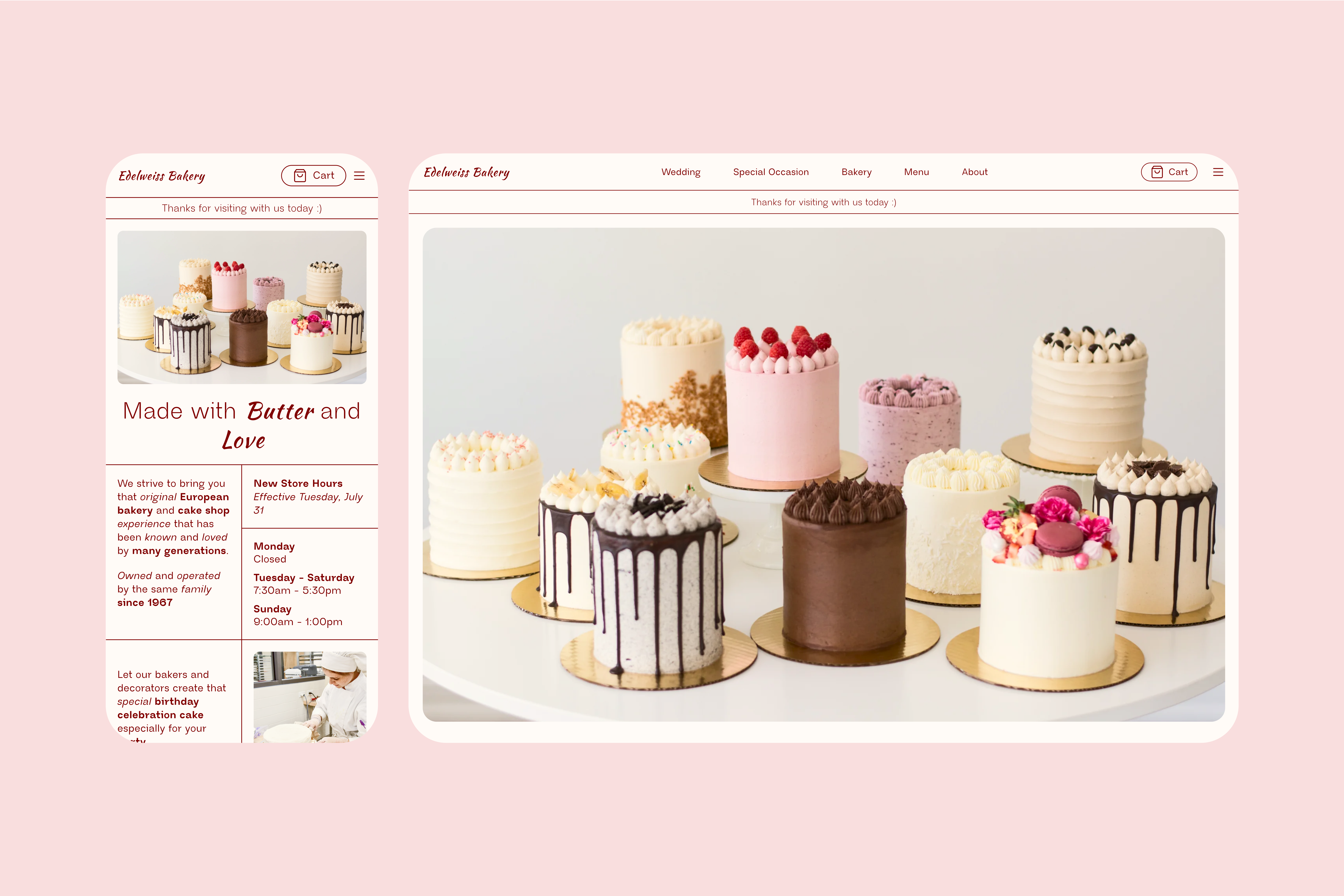

Casual counter-serve featuring sweet & savory baked goods, including bread, pastries & custom cakes.
Duration
February 2024 - March 2024
3 weeks
Location
Providence, RI
Disciplines
Responsive Design
Web Design
Tools
HTML/CSS
Figma
1. PROBLEM
After playing around with the old website, I picked out several key issues I wanted to focus on for this project.
01

The existing website lacked responsiveness, making it challenging for smartphone users to navigate effectively.
02

The layout lacked coherence, with an overload of buttons and inconsistent positioning of images, contributing to a cluttered and outdated appearance.
03

A plethora of fonts, including overly decorative scripts, hindered readability and cohesion.
01

Insufficient contrast in buttons and text, coupled with a lack of alternate text for images, lowered accessibility scores - 80 on Lighthouse - and hindered user experience.
2. PROCESS
Through wireframing, emphasis was placed on implementing a grid-based layout for improved structure and visual hierarchy. Reduction in navigation items, utilizing dropdown menus for streamlined navigation, and experimenting with centered elements aimed at enhancing user engagement and ease of use.

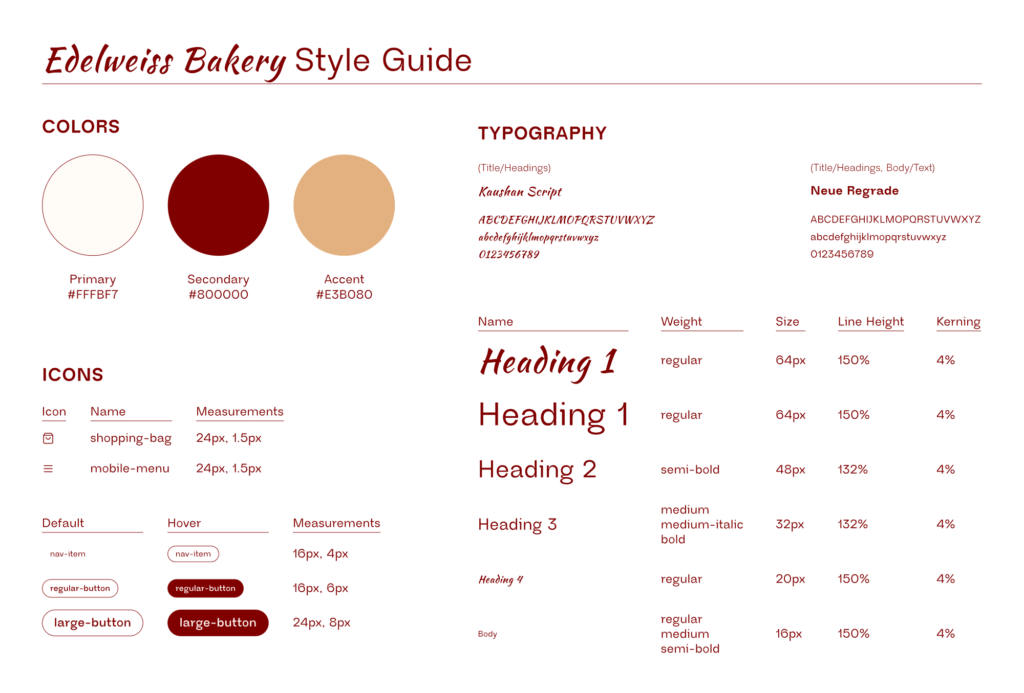
A comprehensive style guide was developed, maintaining elements of the old website's color palette and typography while infusing warmth and brightness into high-definition images. The design aimed to preserve the bakery's essence while aligning with modern design trends.
3. SOLUTION
The final design reflects a significant improvement in usability, aesthetics, and accessibility. Despite challenges in balancing the old website's essence with modern design elements, the redesigned interface successfully communicates the bakery's story and ethos to its audience.
I was able to bring up the accessibility score from an 80 to a 97 by adding alternative text to all of my images and using proper HTML tags when coding.
01

The redesigned website prioritizes responsiveness, ensuring seamless user experience across devices.
02

A cleaner, more organized layout with reduced navigation items and clearer content grouping enhances usability and aesthetics.
03

Streamlined typography with a unified font scheme improves readability and visual consistency.
04

Improved button contrast and inclusion of alternate text for images enhance accessibility and user engagement.
4. LEARNINGS
The biggest challenge of this project was trying to find a way to both preserve the essense of Edelweiss as well as modernize their brand. Although the redesign is completely different from the old website, I attempted to work around this by maintaining some of the same brand colors as well as typography.
This was an incredibly fun project that allowed me to further my coding and UI design skills.