Gifting e-commerce platform designed to help brands automate and scale corporate sales.
Duration
April 2024
3 weeks
Location
Providence, RI
Team
Tiffany Huang
Ryan Peng
Sherry Zhang
Christine Pun / Founding Designer @ Zest
Disciplines
Web Design
Mobile
Tools
Figma
1. CONTEXT
Gift purchasers utilize the corporate gifting page for its specialized product range, discounts, and customization options. However, a crucial functionality missing was the ability to ship entire orders to a single address, prompting users to contact customer service.
The most common use cases for this new shipping method are the following:
🏢 Companies ordering gifts for an in-person corporate event.
🎁 Consumers buying gifts in bulk as party favors.
2. PROBLEM
The absence of a streamlined shipping method for single-address orders hindered user experience. Our task was to incorporate this feature seamlessly into the existing interface.
Our metric of success was to ensure that corporate and bulk gift customers know and understand the delivery options and can easily distinguish between the methods in the corporate gift shop to select the delivery that works best for them.
3. PROCESS
Each team member generated two end-to-end flow sketches exploring various implementations of bulk shipping. Consistent elements emerged, such as placing the new shipping method under the delivery section. However, the method of selecting bulk shipping varied, prompting further discussion.
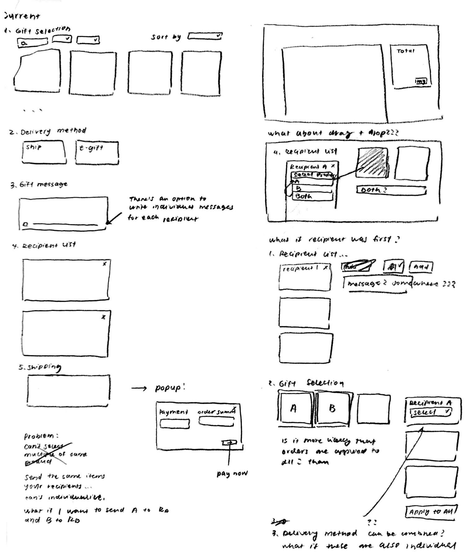
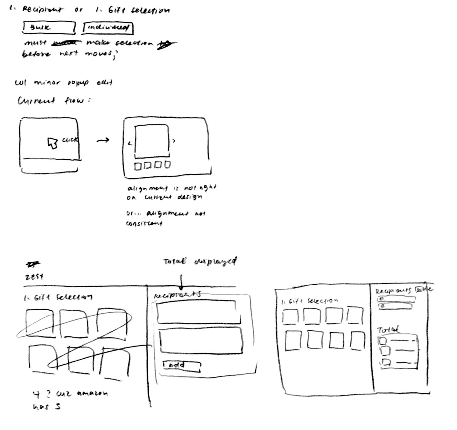
Initial sketches outlined various design concepts. We emphasized displaying shipping costs prominently and opted for a dropdown menu to distinguish between physical and electronic gifts, aligning with existing options. Iterations focused on minimizing clicks and ensuring clarity in the order process.
We finalized design decisions based on wireframes, including:
Scroll ↴

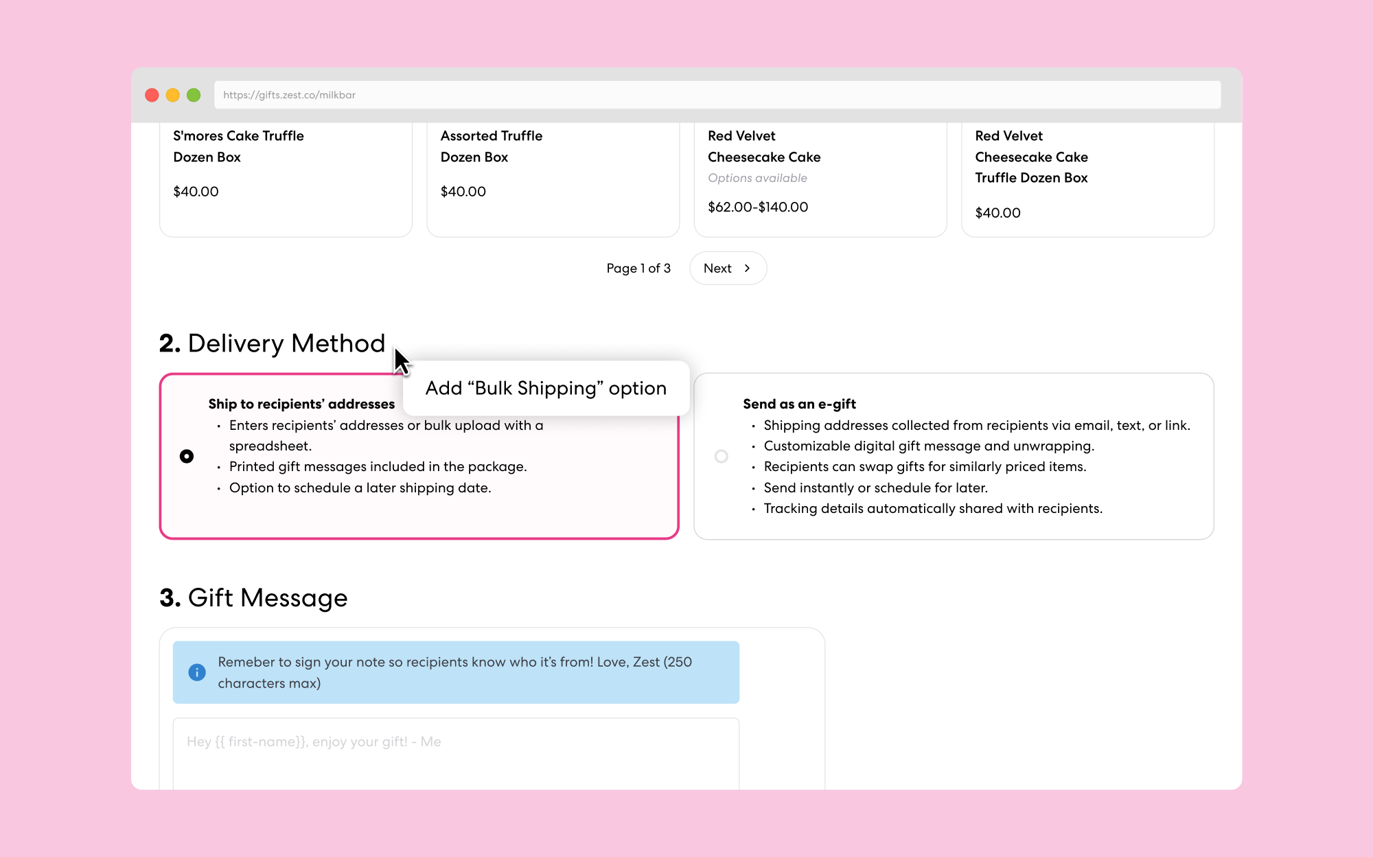
Feedback from Zest's founding designer Christine Pun prompted reconsideration of our design choices. We reverted to a single shipping method for individual addresses for clarity. Additional feedback emphasized the importance of mobile optimization and the potential for user testing to validate design decisions.

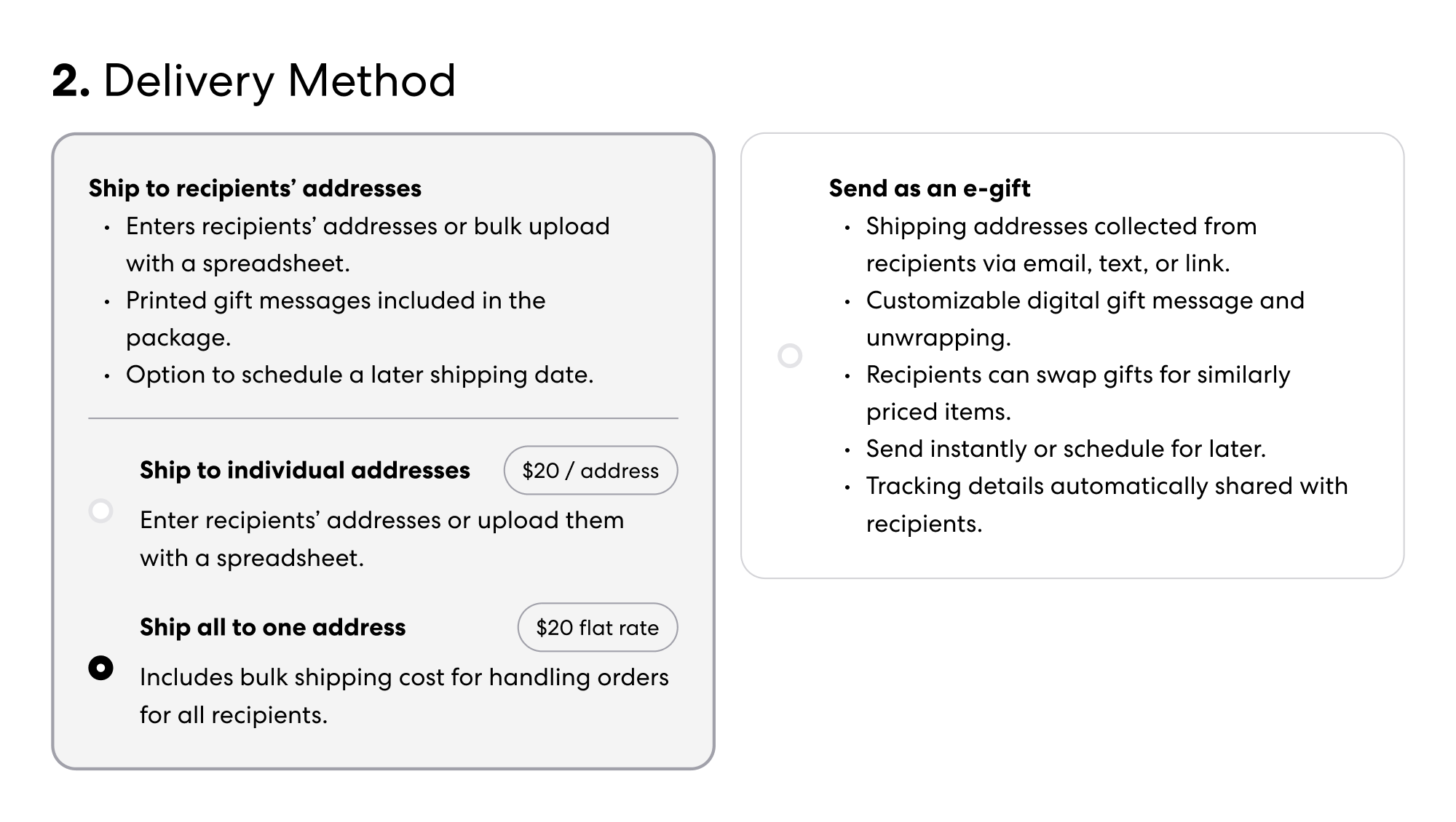
We initially put the bulk shipping option under the existing "ship to recipients' addresses" as a way of grouping both physical delivery methods. However, Christine's feedback informed us that shipping to one address is completely different the current shipping to recipients method.

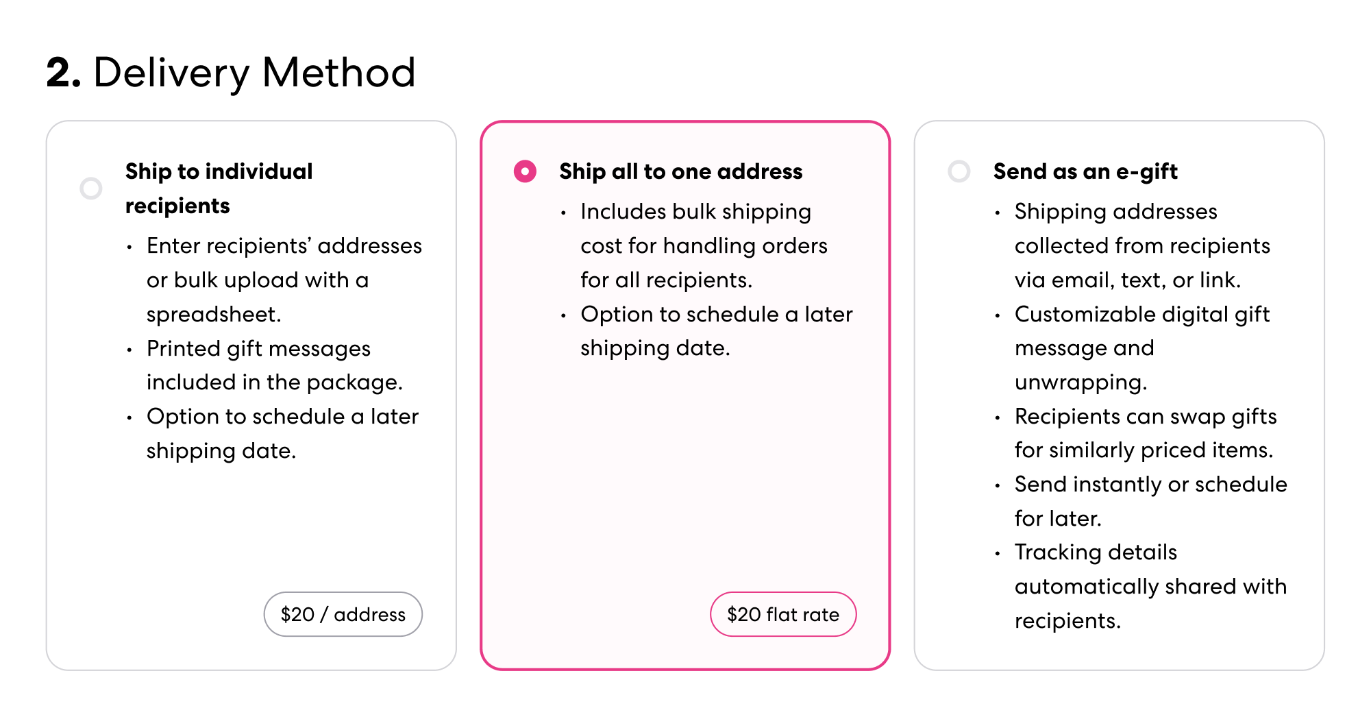
Therefore, we decided to create a separate third shipping method since the copy was too different.
🍪: We love this idea of always the active order summary. How do you see it working on mobile?
Although outside of our initial scope, Christine was interested in seeing how our shopping cart would respond to mobile devices. I designed the mobile cart to be fixed to the bottom of the screen, rather than the top as my teammate had suggested, in order to be less distracting to the user.
Provided Figma screens from Christine, Zest's founding designer, I consolidated existing guidelines and our new additions. Since Zest uses brand-aligned colors depending on whom they work with, I used Milkbar as our brand of reference.
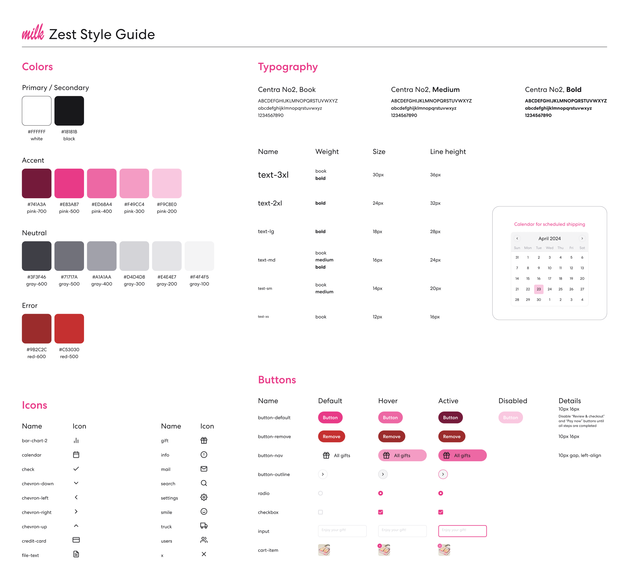
We enriched the guide with additional icons, hover-based item removal, and a custom calendar for the scheduled delivery date selection.
We met with Christine once again and Jeremy, one of the co-founders of Zest, for a final walkthrough of our designs. Feedback on the hi-fi prototype was positive, particularly praising the sticky cart feature and enhanced user control.
Some notable remarks included:
🍮: I love what y’all did with the sticky cart!
🍪: You gave us a lot - more than enough for us to get this feature to a very good point!
Since the project timeline was limited, we did not get the chance to test our designs with any potential users. Our meeting with Christine solidified the importance of user testing, which is something we hope to give more attention to in the future regardless of the scope of a project.
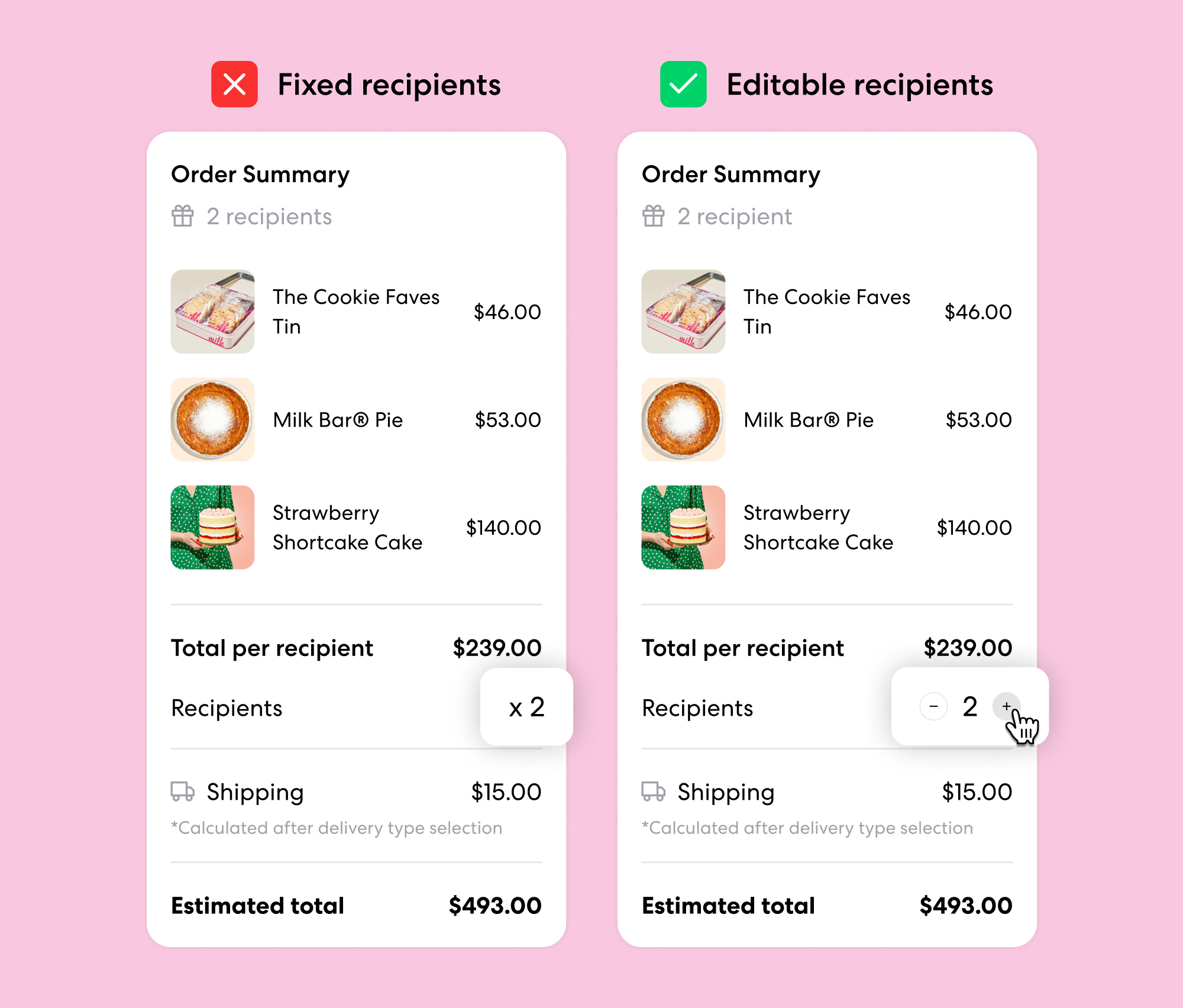
However we were asked to make one revision, which was to implement a way for users to also select the number of recipients in the cart.
This was a simple fix as we had already implemented a counter in the recipients field of the page. Thus, we added a similar counter to the shopping cart.
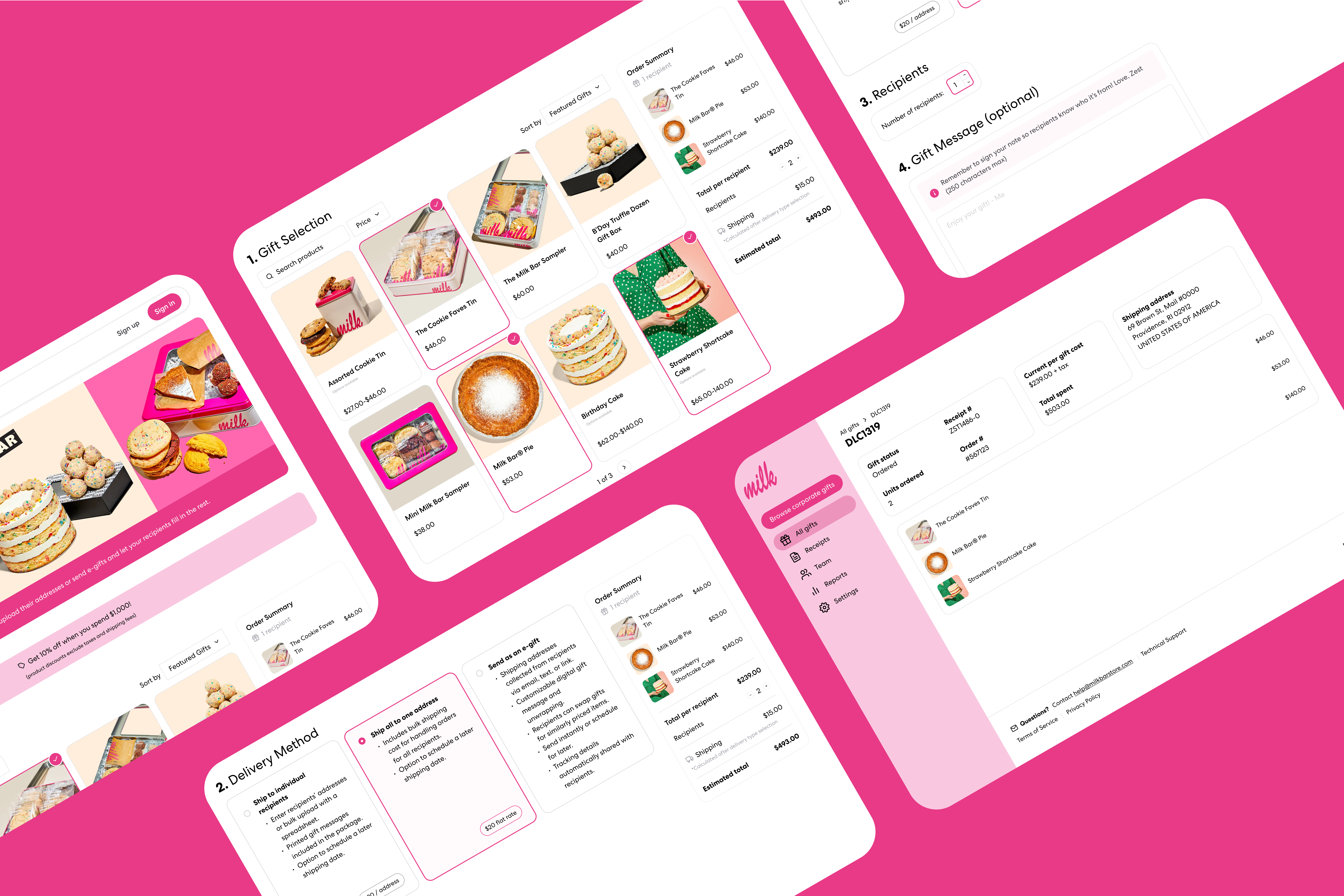
4. SOLUTION
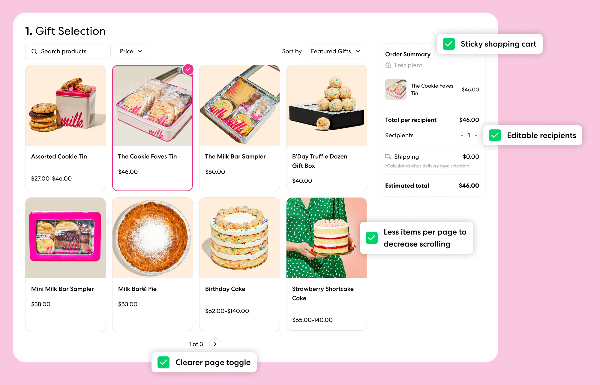
Users can view their order summary and have an estimate of what their total is before moving onto the next step, Review and Checkout. This eliminates the need to go back and forth between pages to edit the gift order.
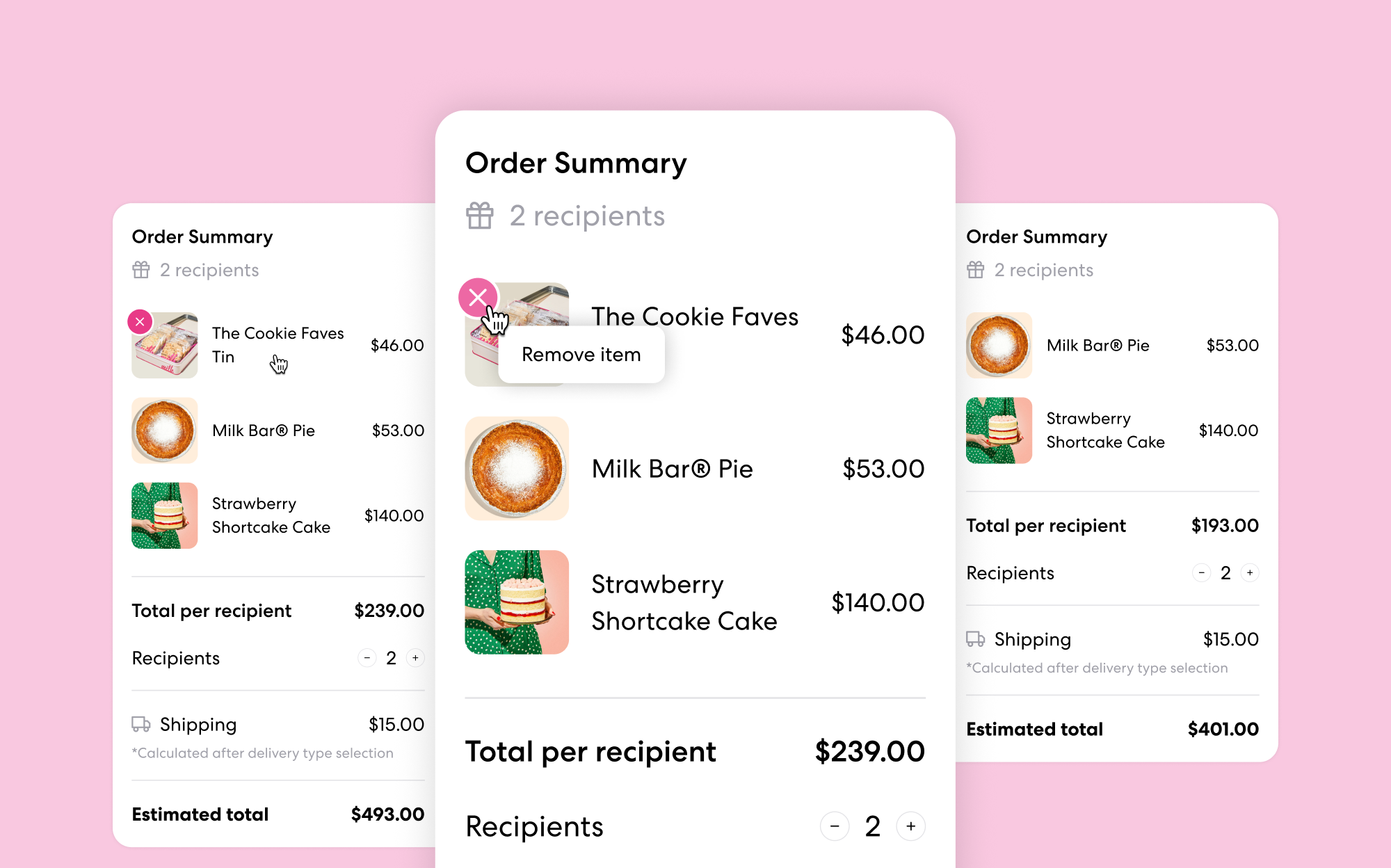
Furthermore, we enhanced user interaction by incorporating features such as the ability to remove items from the cart upon hover.
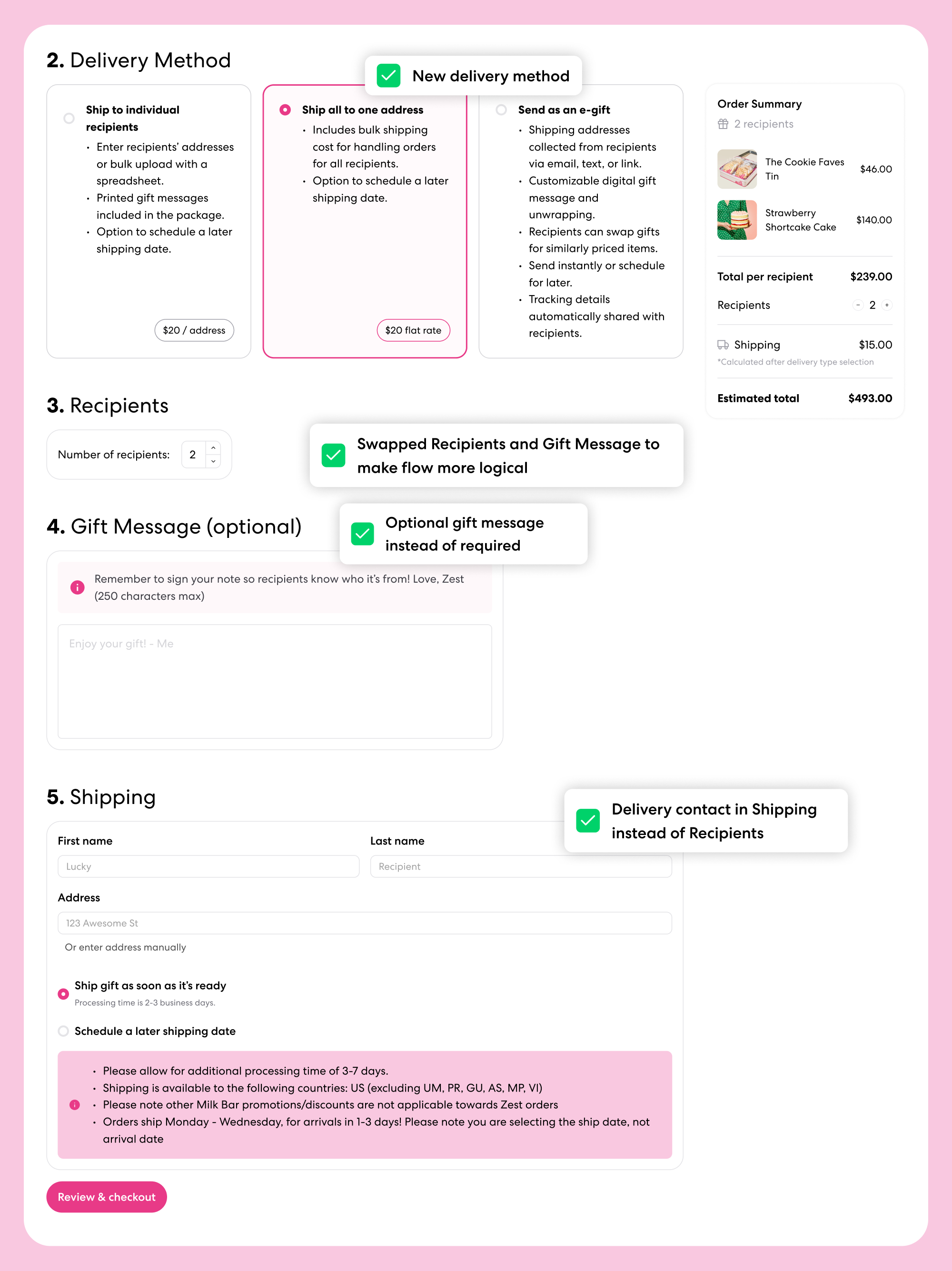
New delivery method that allows gift purchasers to ship multiple packages to one address, usually themselves.
5. LEARNINGS